Happn
The challenge
Happn is a French dating app created in 2014, centered around geolocation (meeting spots or simple crossings). The app aims for users to express their interests based on their location or favorite places, called "spots," to break down barriers and facilitate real-life encounters.
With my team, we met Paul Antoine Campos, the Head of Design, who asked for our help with the "Hub" section, where his team was facing challenges. Despite the page having great potential, users tend to leave without any interaction.
My role
Together with a team of three designers, we had two weeks to propose a solution. To address the issue effectively, we covered every step from Discovery to Delivery, working iteratively whenever possible. I personally focused on user interactions during interviews, including research and testing.
The Results
We proposed a redesign of the Hub section, focusing on its filtering functionality. With this new filtering system, we ensured that users engage with the section while meeting their needs:
- 4 out of 5 test users navigated the Hub with ease and appreciated its appearance
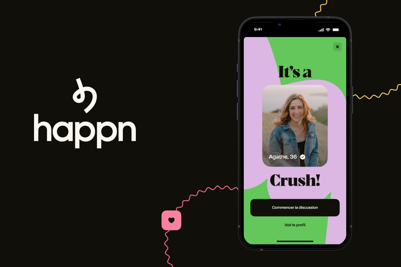
- 5 out of 5 test users reacted positively (and with surprise) upon seeing the "Perfect Fit" profile and were inclined to interact with it.
- 8% to 16% Likes sent in the app from this section
“Oh perfect fit, I like it.”
[scroll to discover the process ↓]


The process
We started with a open question:
How can we improve the activity on the Hub and encourage users to return?
How do we know it’s a problem?
The Hub allows filtering of recently crossed profiles. However, despite being the 3rd most visited page and with 45% of the DAU (Daily Active Users) who visited it, 75% of users leave the page without clicking on any category and only 8% of Likes sent in the app originate from the Hub.
Our goal is to ensure the activity on the Hub and improve the number of likes sent.
How do they date with apps? [u.research]

In order to better address Happn's problem, we spoke with four dating app users. Through these interviews, we aimed to understand their behaviors and habits regarding such apps.
We learnt
- [3 out of 4 ] Shared interests are a real plus
"Someone who likes to travel implies that they like adventure, that they may be like the unexpected and that they don't like life to always be the same”. Nicolas
- [4 out of 4] Photos first, sometimes in spite of themselves
“My first judgment is going to be based on the photo”. Anissa
- [4 out of 4] Meeting people IRL remains essential
“In everyday life when I meet people face-to-face in person, I look at the person's energy, the way they express themselves.” Louise
[Refinement of the problem]
How can we encourage users to discover and express their interests in profiles that appeal to them?
Based on insights gathered from the various interviews, we determined that the following actions are necessary to improve the Hub's performance (currently 8% likes and a 75% bounce rate):
- Profiles should be displayed directly on the Hub page, with a focus on making them visually appealing through prominent photos.
- Information such as hobbies should be highlighted to encourage initial interaction, ultimately leading to in-person meetings
Let us explore and brainstorms
Using a mind map and analyzing competitors, six key themes emerged to help users discover and interact with profiles they might like: Data / Discovery / Interactions / Perceptions (senses) / Emotions -Irrational / Characteristics.


Then we kept these ideas
Using the Crazy 8 method, we generated ideas and evaluated them against our objectives.

We decided to keep two options:
- Option 2: Aligned with Happn's identity, it should facilitate IRL meetings by suggesting locations and interactions between users with shared interests, and offers an alternative profile filtering feature
- Option 4: A recommended profile feature that should enhance user interaction within the Hub. Although not innovative, it builds user trust by presenting profiles that match their preference
Options 1 and 3 were discarded due to potential user frustration, the risk of being perceived as a paywall, implementation challenges, and a lack of personalization.
Our V1

The ideas were refined and prototyped as follows:
- Filtering method: a filtering tab allows users to discover profiles based on specific search preferences. The "Par Passion" tab shows profiles based on passions, hobbies, and interests, while the "Par Envie du moment" tab is focused on location or activity criteria.
- Profiles & content hierarchy: profiles are displayed in scrollable galleries for better clarity and ease of navigation.
- Optimized search: optimized search forms enable more precise profile searches.
- Accurate compatibility: users can discover one highly compatible profile per day based on their current search criteria.
Testing
With our v1 ready, we needed to test it with users to validate our hypotheses. We invited each tester to complete specific tasks within the Hub, including discovering the new Hub, using the filtering tab with sub categories based on their preferences, and searching for and interacting with different profiles.
Each task was scored from 0 to 5, with 0 indicating failure and 5 indicating success. We also collected feedback on overall user experience, including frustrations and expectations, as well as the look and feel of the new Hub.

We learnt
[3 out of 5] Users struggle to understand the filtering differences

"It's general common Passion, to be able to exchange with her (long term)... Envie du moment: to meet someone for a while (short term).” David
Solution: A clearer distinction between the two filters
[4 out of 5] The access to the form and its appearance caused issues

“I didn't understand that the question was associated with the current mood, I thought it was an advert”. David
Solution: Review the modal layout and make it easier to modify filters
[4 out of 5] Criterias were too generic and not enough

“It's too vague for me, it's like - I like to breathe, I like to eat, I like to laugh etc.” Thibault
Solution: Increase the number of selectable passion tags
[5 out of 5] Users appreciated the Perfect Fit but wanted more information on the other profiles.

“Oh perfect fit, I like it.” Cloé
Solution: Highlight information on profiles presented on the Hub
Iteration to v2
Thanks to the feedback from the tests, we were able to make the necessary corrections and propose a v2.
You can try the final prototype here
Or just enjoy the show below ↓
Final learnings
I personally enjoyed this project because it gave me the opportunity to research and engage with users on topics related to their intimacy, to understand their needs, expectations, etc.
They provided valuable insights that allowed us to build and propose a solution to Happn's problem.
Given the time constraints, I also realized the importance of focusing on the essentials in design. A redesign doesn't necessarily mean starting from scratch but rather optimizing to best address a given problem.
If we had more time, it would have been interesting to:
- Personalize the "Envie du Jour" by adding a prompt associated with a specific criterion when the user enters the section, ensuring retention and increasing activity within the Hub.
- Develop spot recommendations to encourage IRL meetings (e.g., using APIs or partners like TripAdvisor, La Fourchette, Google Maps).
Finally, I can only thank my colleagues Julie C. and Axelle P., who accompanied me throughout this project over the course of two weeks.


